Everyday Crypto Spending
Providing the ability to spend crypto like cash
DashDirect was a finance platform that enabled owners of Dash to instantly purchase gift cards at over 250,000 merchants in the US. No fees or waiting.
Industries
Fintech
Tools
Figma FigJam Photoshop
Services
UX Design UI Design
Date
December 2020 to January 2023
DashDirect was conceived as a way to allow Dash holders to instantly make purchases at a variety of locations nationwide and online. The functionality of Dash allowed Users to instantly make a purchase, rather than waiting a period of time for the crypto to transfer from their wallets. Ionia partnered with the people running Dash to fulfill this dream by utilizing Ionia's existing platform and merchant database to create an app that was easy to use, and offered real world utility for its users.
Following six months of design work and an additional two months of development refinement, the app launched with a streamlined purchasing experience, modernized navigation, and an updated UI. The DASH community responded positively, with each new update further building on this solid foundation.
Key achievements include:
Public launch of the first-ever app enabling instant cryptocurrency use for real-world purchases
4.5-star ratings on both the App Store and Google Play Store
65,000+ active users
Development continued into early 2023, focusing on enhancing the app with additional features that further advanced the seamless use of cryptocurrency for everyday transactions.
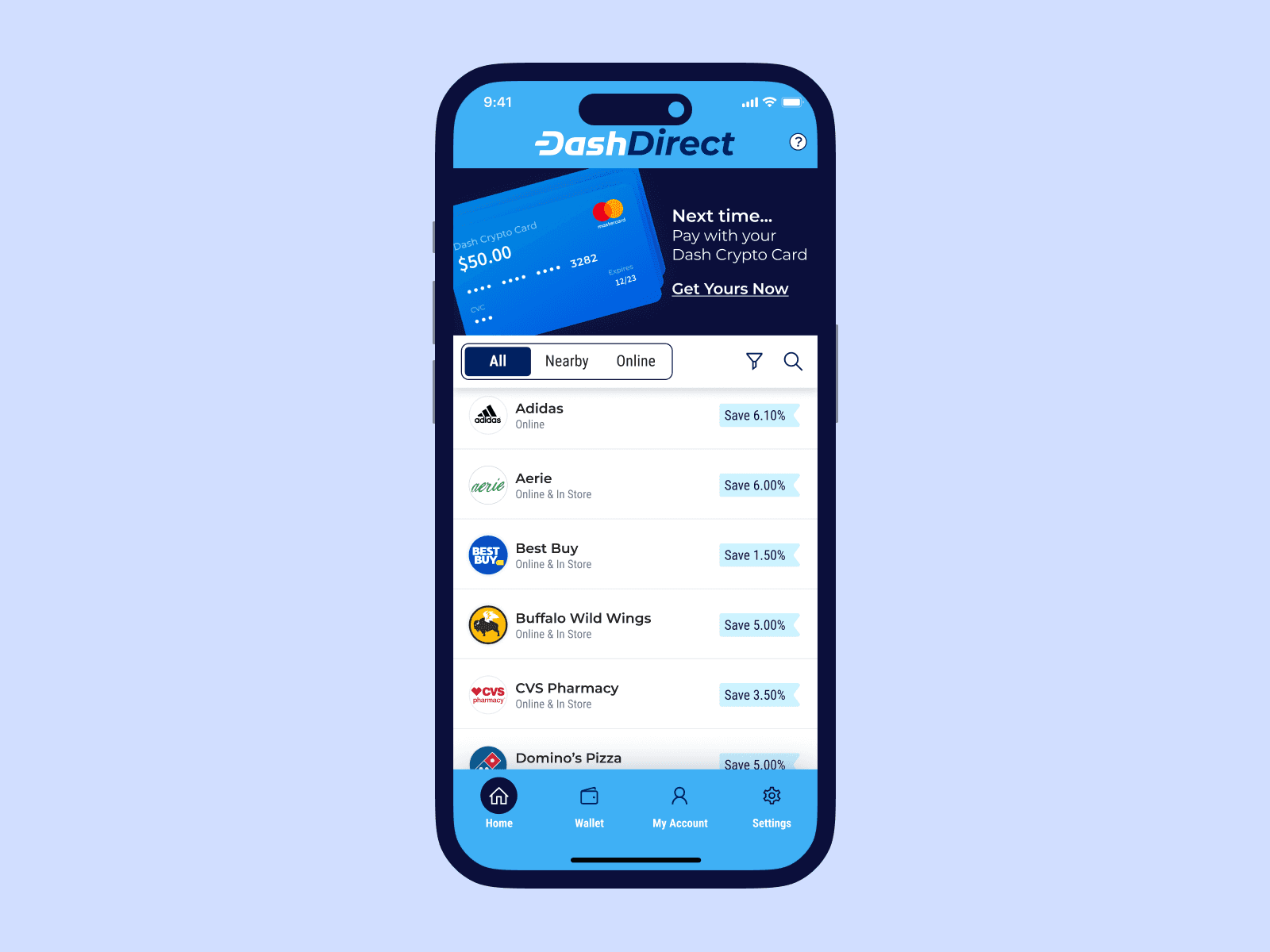
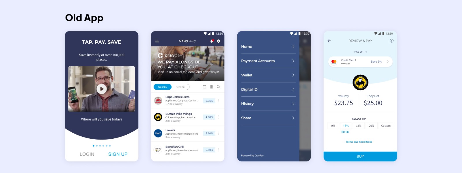
Mobile App Revamp - Modernizing an Outdated App
Based on my initial assessment of signing up and using the app, there were immediately some issues I noticed around how information about the value the app provided was presented, the length and complexity of the signup flow and issues with the flow for purchasing a gift card and then also the overall navigation of the app. To help validate the issues I was finding, I ran a series of user tests with 3 different users to understand better what issues others were having and questions that had about the purpose and functionality of the app.
With this information, I also sat down with my team and the CEO of the company to understand better what his vision. At a high level, he wanted an app that was easier to use and navigate, while also updating the look and feel of the app for a more modern experience. He was aware of the issues I’d encountered during the user testing, and offered some suggestions on how he felt it could be improved.
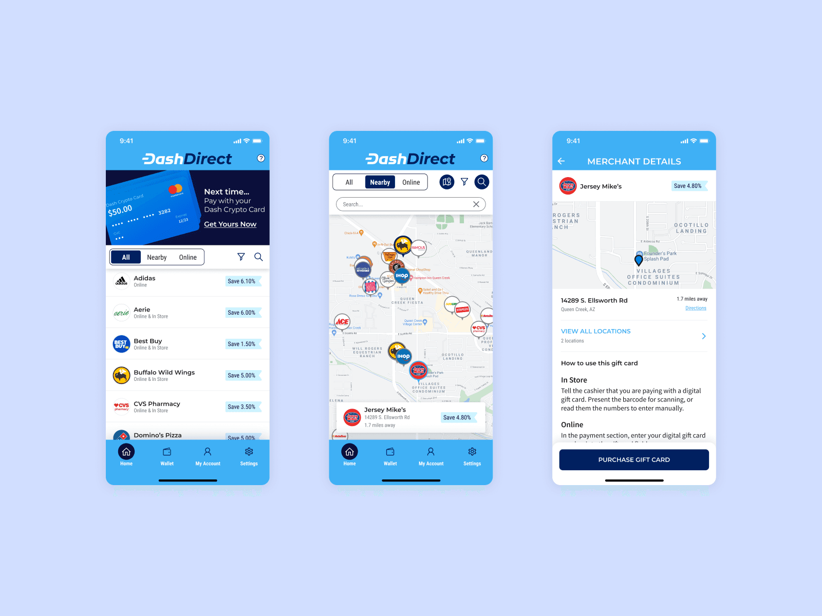
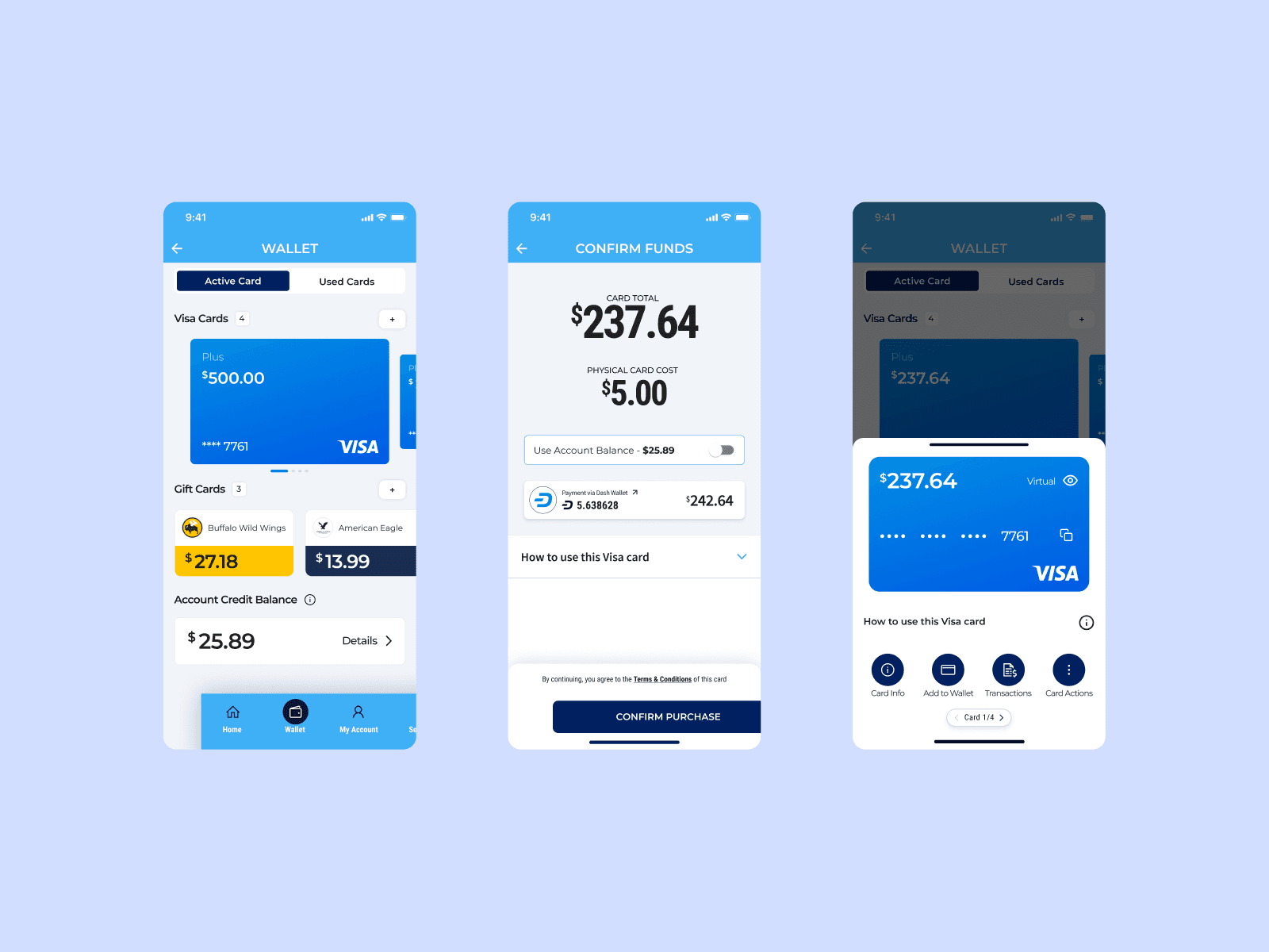
Improved Navigation
One of the issues the people tested had with the app was navigating around to different areas. The main purpose of the app was front and center, but access to additional information relevant to the user such as their profile, settings and cards they’d purchased was harder to access. How information about past purchases and unused cards was presented was also hard to find.
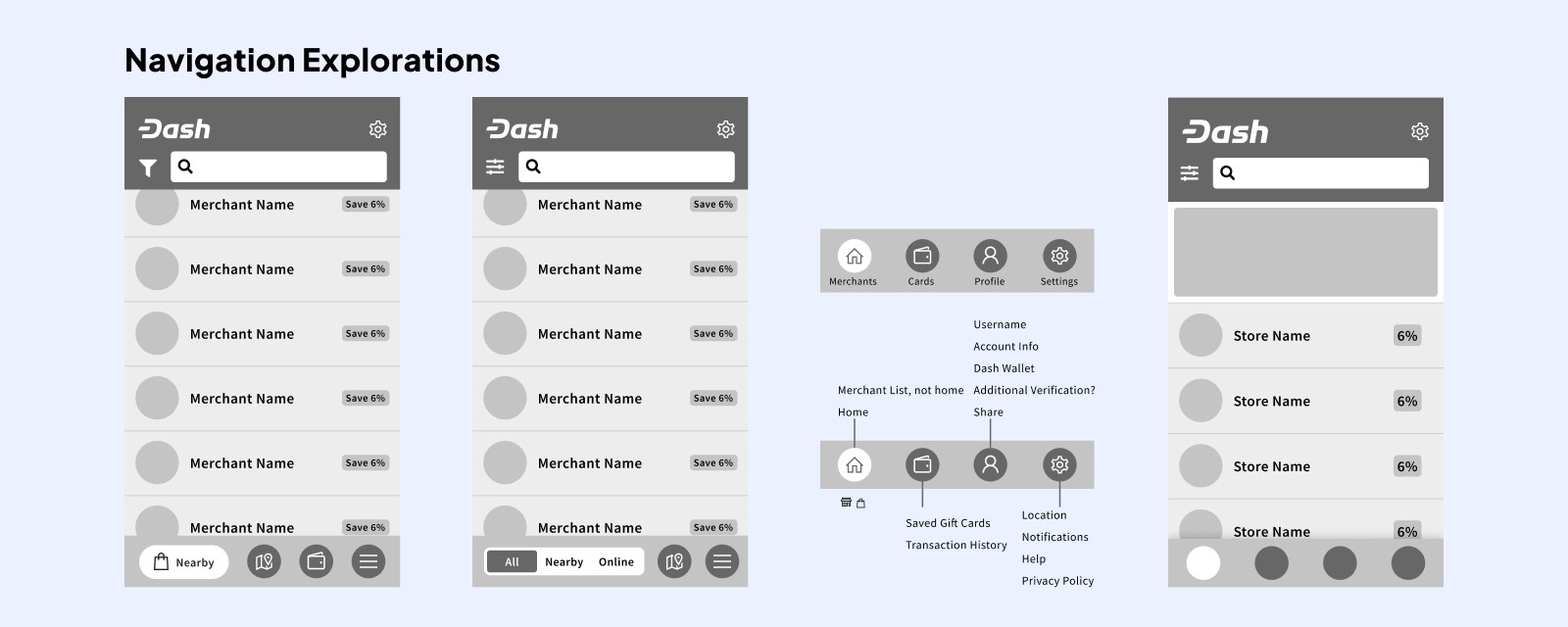
I went through all of the existing functionality and then categorized it by what the User was would use each screen for:
Home would be where the User was offered deals, initiate the purchase of a gift card and could search for a store they wanted or was nearby.
Wallet was where all information related to gift cards was kept, with new and unused cards stored and easily accessed.
Profile contained all information related to the User and their account, as well as access to tax information, which was needed to do crypto regulation.
Settings had everything related to privacy, permissions and general app settings.
At each step of the process, I would review with the team and key stakeholders to get feedback and guidance on the direction for the updated designs.
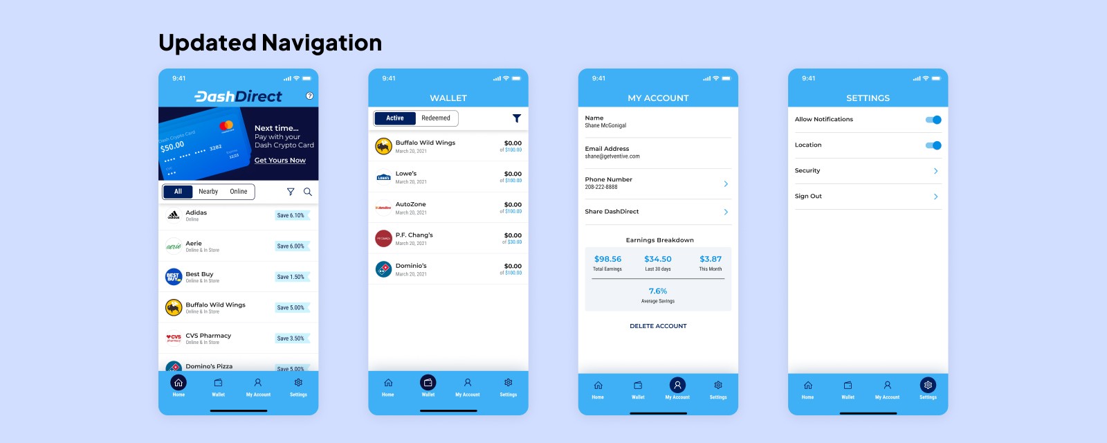
The new look and feel was enthusiastically accepted by the users, who praised the modernized look and feel and appreciated easier access to information they needed.
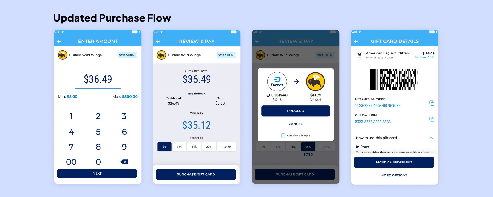
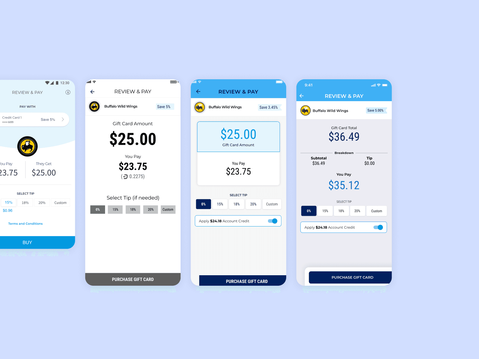
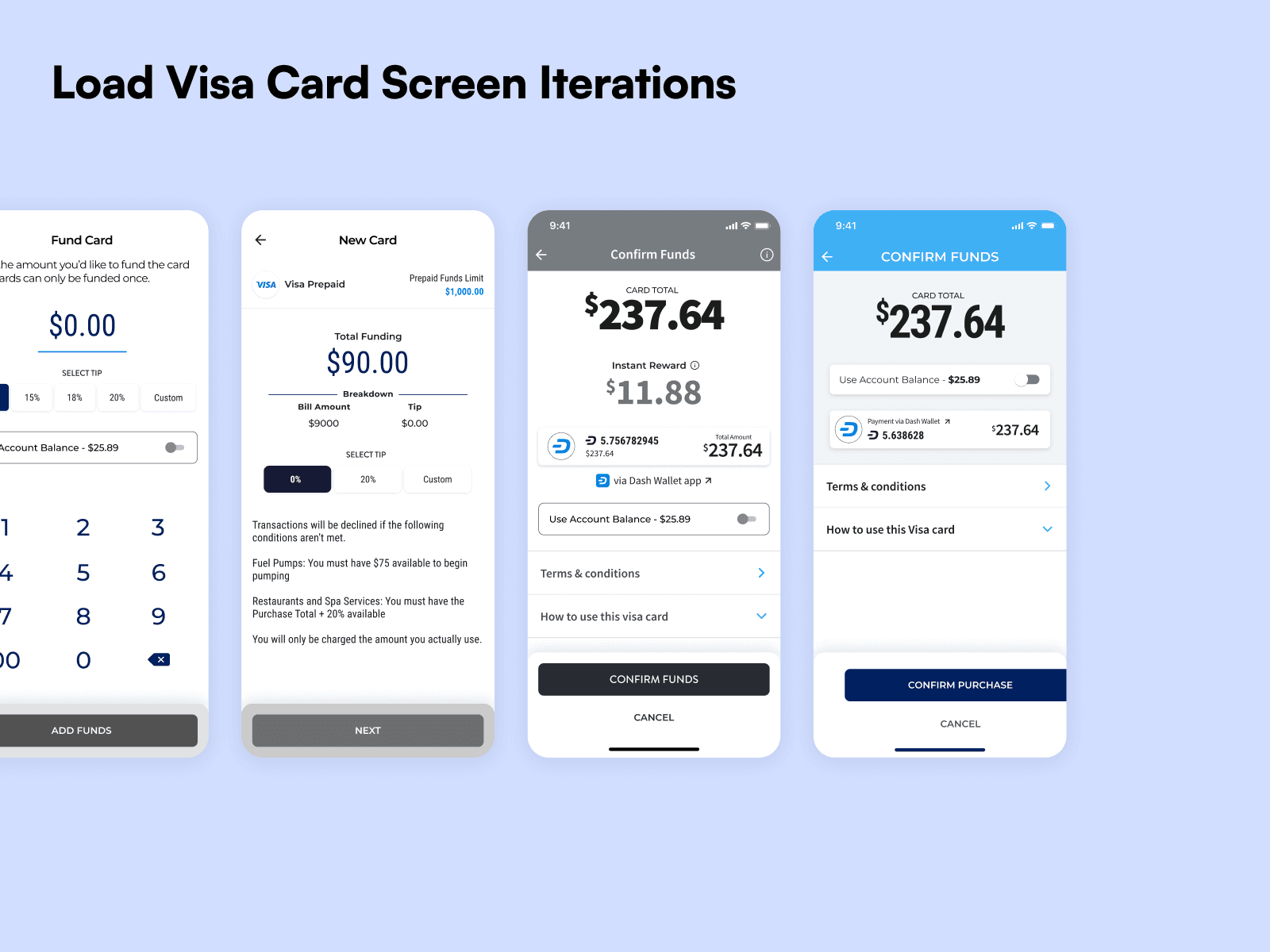
Improved Purchase Flow
In user testing, a common issue that was encountered with users was how information was presented. There were a lot of steps, with each one changing as the purchase was filled out and finished. Users were getting confused and overwhelmed by the different information that would be presented at different stages of the checkout flow. To help simplify this, I creating a consistent hierarchy of information on each step of the process to help make sure that relevant information was presented clearly to the users.
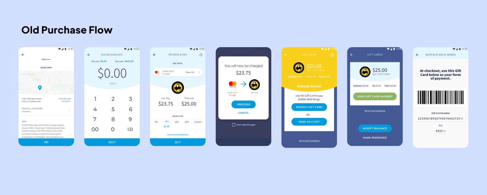
The end results shortened the flow considerably, removing some extra screens and also simplifying the actions required to complete a purchase. Information about the card and what the user could do with it were simplified as well, creating an overall better experience.
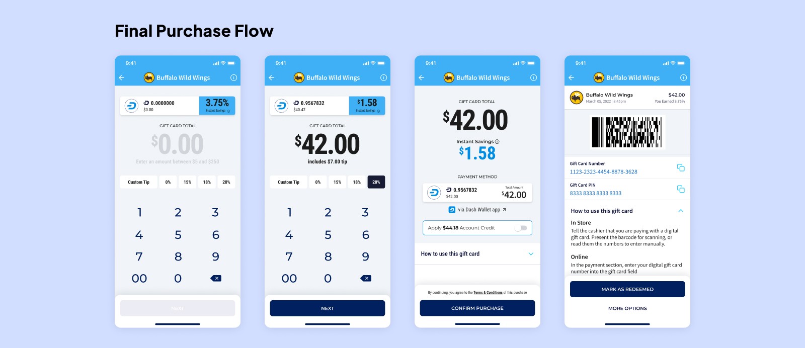
Approximately a year after the initial revamp, I led an initiative to further optimize the purchase flow. Drawing from deeper user insights and usage data, I worked closely with and directed the efforts of another designer to build upon the existing framework, shortening the flow even further and ensuring that crucial information remained easily accessible. This new iteration tested exceptionally well with users, surpassing previous feedback scores. While this enhanced flow was ultimately not implemented before the app's closure, it underscored our commitment to continuous improvement and user-centered design.
Research Text