AI Powered Candidate Screening
Providing insights into candidate screening performance
With the amount of people who apply to fill open positions, it can be overwhelming for a hiring manager to review and find those who may actually be a good fit for a position. AI offers the opportunity to assist with this process.
Industries
Human Resources
Tools
Figma
Services
Lead UX Designer
Date
2024
Evaluait is a platform that offers the ability for companies to easily perform screening interviews via an AI powered interview with potential candidates. The User can create a simpler interview with a goal and then send it out to anyone who is applying for a position. Based on criteria set by the User, the AI conducts short screening interviews and then brings back the results and helps narrow down what can be a large pool of candidates to a more manageable size that can then be interviewed further. This project was designed and developed with a small team. I served as the lead UX Designer, overseeing both the UX and working with a UI designer for the visual.
I knew that to help the User understand how well a candidate had performed, I needed to come up with an in depth analysis of the interview and the information contained within it.
My first exploration was based off of a conversation with the PO around how we could expose the interaction between the AI agent and candidate. I wanted something that felt more natural, like a conversation between two people. At this point in the process, we were looking for 3 specific points:
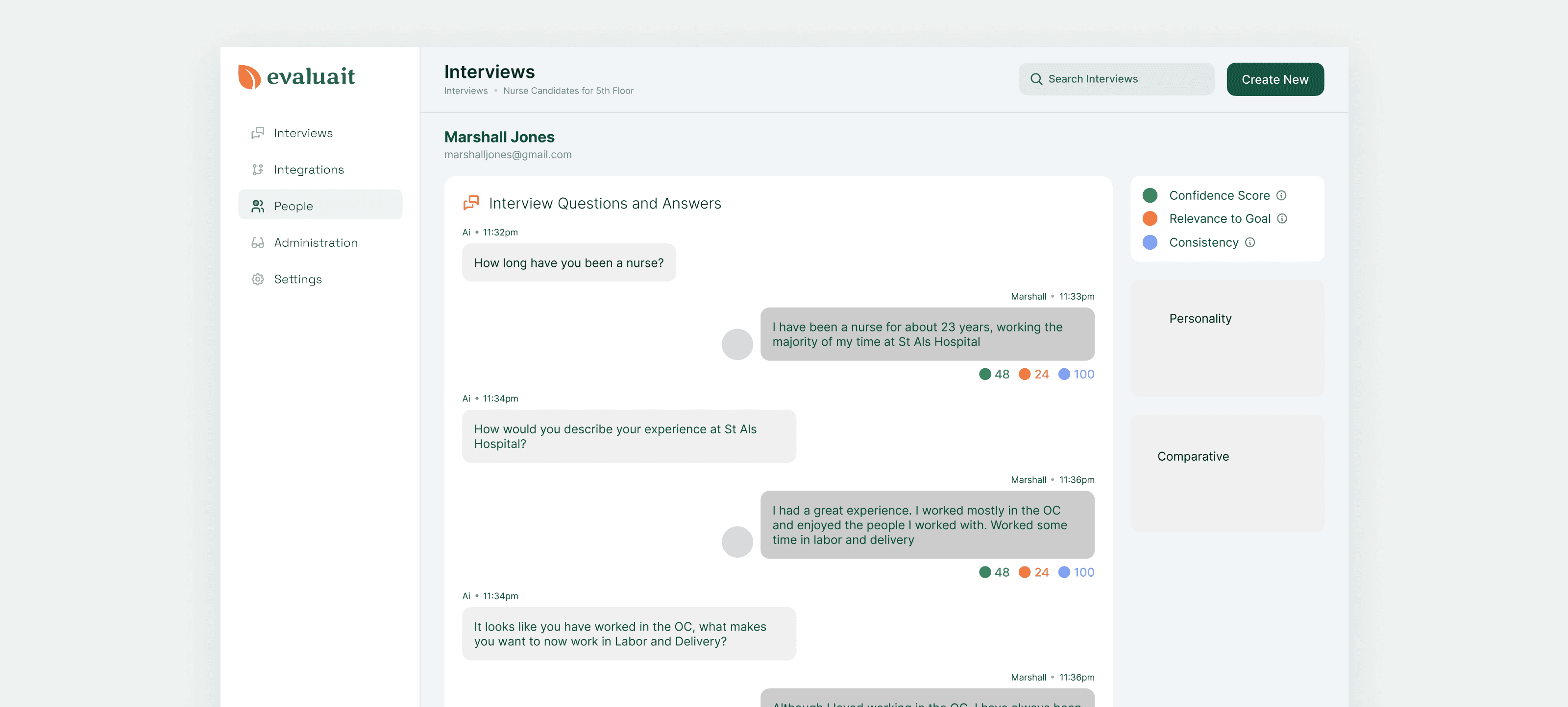
Confidence - how confident was the candidate in their answers
Relevance to goal - Were the candidates answers helpful to what we were looking for?
Consistency - Did the answers help tell a cohesive story of their experience and skills?
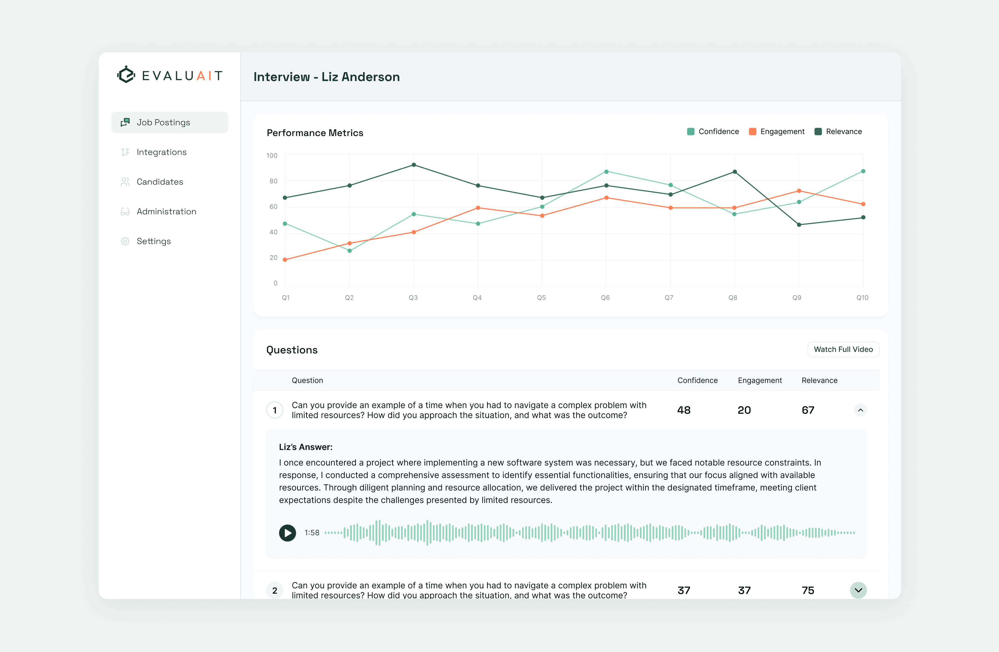
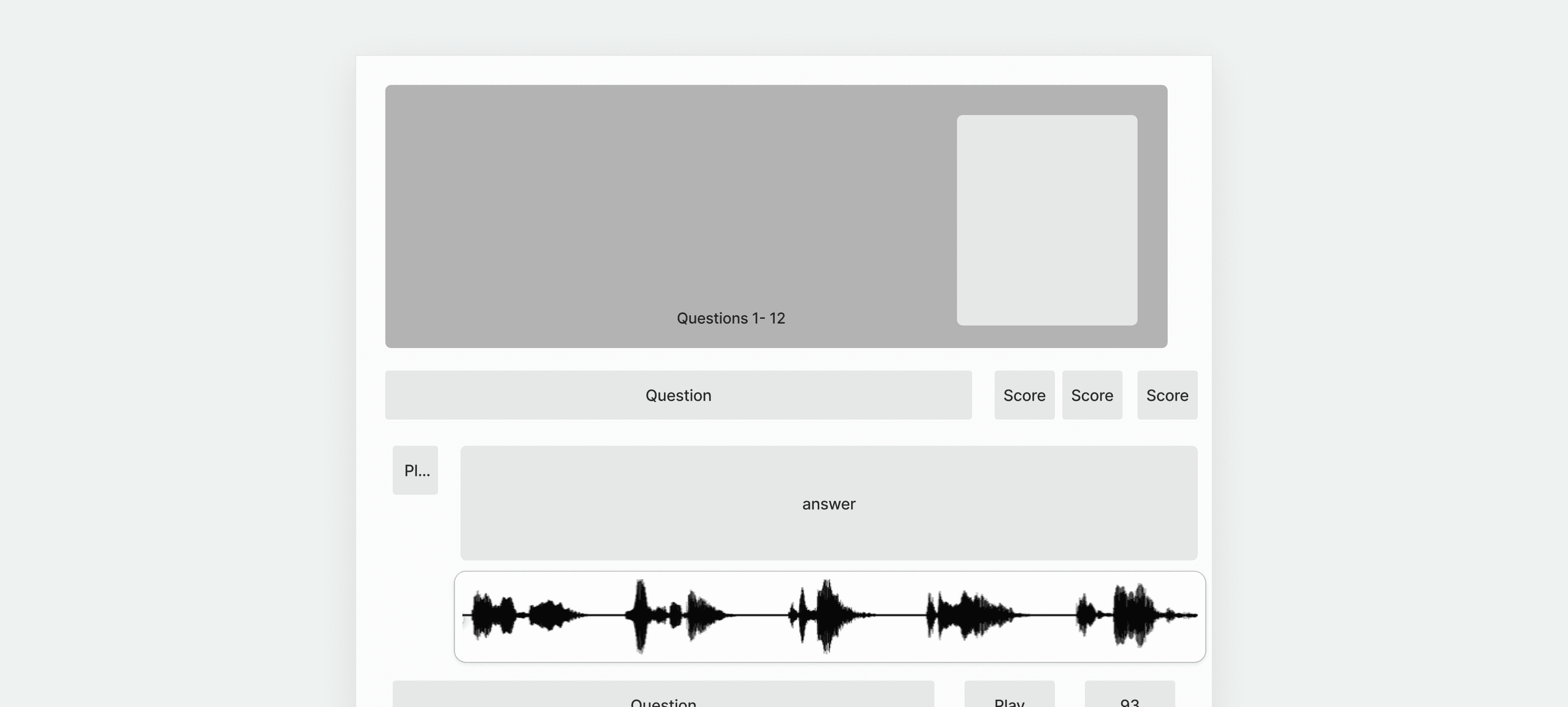
Each answer would have a rating below it from 1-100, giving a quick overview of how qualified they were for the position.
After some discussion and internal testing, I decided against this direction. It wasn’t quite working as I’d intended, with the interface feeling less natural than I’d wanted.
Working with the PO on the project, I came up with a different option, this time aiming for something that went more of a dashboard route, with a high level overview at the top, and then a breakdown of the candidates scores below.
After some iterations, this version was received greater positivity. The overview at the top served to give a quick idea of how the candidate did, and then the information below allowed the User to go deeper into the actual interview.
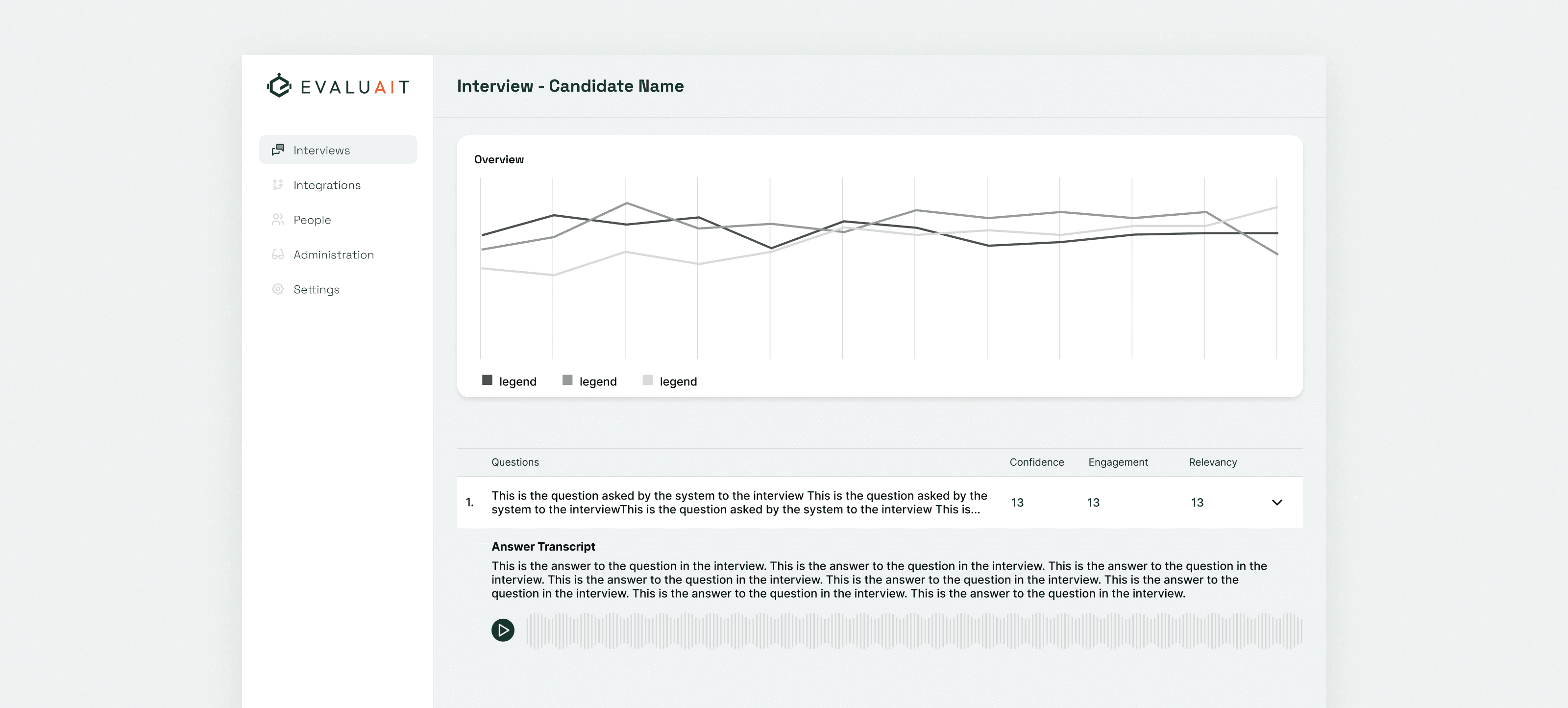
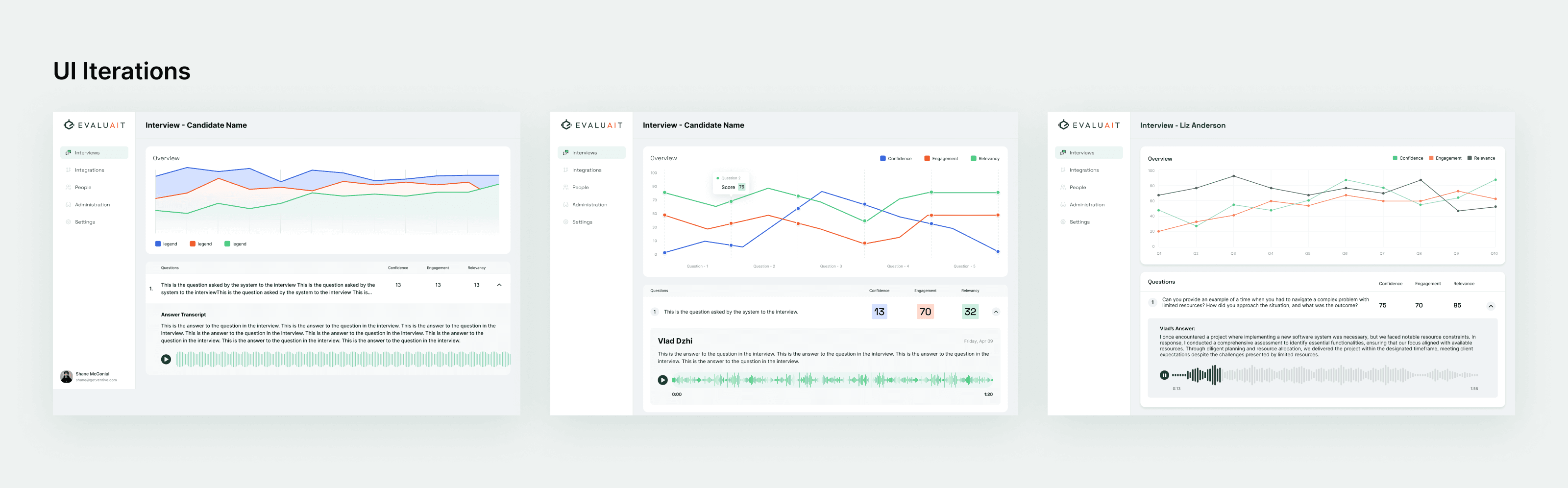
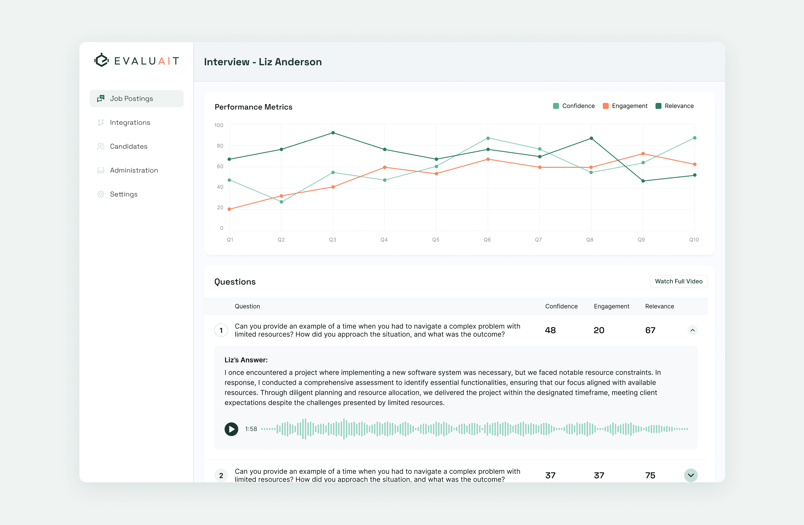
The final design worked much better in providing the User with an overview of the interview. At a glance,they had an overview of how the candidate performed based on the key metrics defined. The graph provided an simple way to review how these metrics evolved over the course of the interview.
Below, each question that was asked was available for individual review, allowing the User to clarify something that was said without having to rely solely on the AI’s breakdown. A transcript of the answer, as well as the audio recording are both presented for review as needed.
Research Text